Evaluate the adverts
Learning Outcome 3 (U20): Be able to produce
the planned media components
Merit - Codes & Conventions, Planning & Research in Real Media Products
Billboard

Magazine
 Video advert
Billboard
 The advert that inspired us to make our PhizWizard billboard avert was this Diet Coke advert. This advert has put their slogan on a large chunk of the advert. We have also done this with our billboard avert. The slogan we used was "A drink to remember" This is effective because it is easily visible for people to see. Even those who have poor vision will be able to read it. Another reason why it is good that the slogan is big is so that people remember it. If people remember the slogan they will know that PhizWizard is "A drink to remember" and are likely to buy the product. One more way that this advert inspired us was that they used a colour scheme that is associated to their company and product. Diet coke use grey and white as on their logo. The PhizWizard logo is blue, pink and purple. We have used this colour scheme on the billboard advert so that these colours are associated with our product and logo. It is beneficial that this is done so that whenever customers see these colours it reminds them of PhizWizard and the likelihood of them going to by the product increases.
Magazine
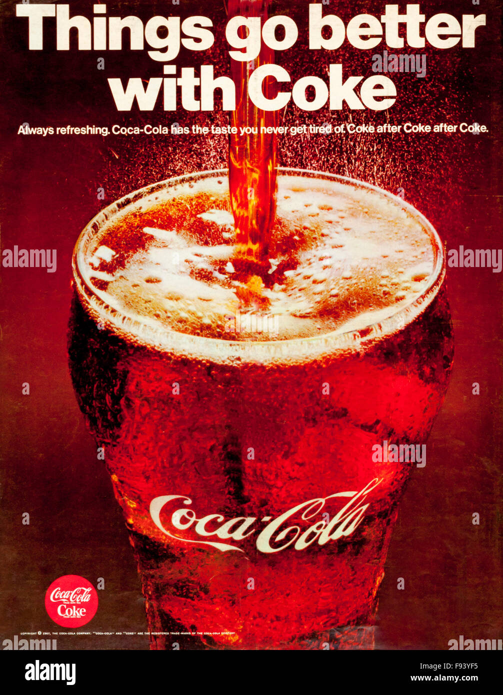
The advert that inspired us to create the magazine advert was this Coca-Cola advert below. We used the same imagery as the Coca-Cola advert. We took the idea of the product being poured into a glass. This links to the codes of convention because as both our brand and Coca Cola are fizzy drinks in the image below you can see what the drink is like as it shows the drink fizzing within the glass.
Something else we took from this advert was that we used our logos colour scheme. This is because the colours that are used in the advert is likely to remind of the brand. Brand awareness is important in soft drink adverts so that not only the advert being advertised is being advertised but also other product that the company sell.
Video advert
In the video advert we zoomed into to our product often. This shows that the main focus of the advert is on the drink and is also likely to tempt a viewer to buy it if all their attention is on the drink. The red bull advert (example of 18 seconds into the advert - https://www.youtube.com/watch?v=zIASTEpLk90) inspired us to make our characters in the advert seem to have a fun and unique time while drinking the drink. After the character has a sip in our advert it goes back to a 80s party where it looks like everyone is having a good time compared to when everything is noremal before having tried the drink. In the red bull advert there are a band of animals flying over two fish that look like they are not enjoying themselves as they did not enjoy the drink. This shows codes and conductions to soft drink adverts as after trying the drink they want to make you feel as if you will have a great time. We were inspired by this advert as we wanted to demonstrate that by drinking a can of Phizzwizard, you too can have a good time.
Billboard
The visual diagram was very useful when designing the final product of our billboard advert. It looks almost exactly the same as the final product. It was useful because it help us understand where it would be best to put things like he slogan. We put the slogan across the top with the drink right below on top of ice. We decided that this would be a good idea because it would show the audince that it is a drink that is unique and also refreshing. It also infers that the drink is of some kind of royalty as it sets on top of a thrown of ice cubes. Our proposal also enabled us to expand on the billboard and justify the purpose of it.

Magazine
The visulation diagram was very helpful when it came to making our final magazine advertising campaign. This is because it helped us decide on the image we would be using (pouring the Phizawzard into the glass). If we didn't have the visualation diagram it would take a longer time for us to think of an image, therefore, a longer time to release the final product of our magazine advert. It also helped us to consider font sizes. Our mood board assisted our colour choices, and from this we expanded on the different colour palettes.

Video advert
The story board provide to be a major advantage when creating our video advert for PhizWizard. This is because it allowed us to instantly start recording a follow a structure that we had put out for our selves. If we did not create a storyboard we would not have a structure to follow and it is likely that we would often make mistakes. This would have proved to be time consuming as we may not like the ideas that we put out and we would have to re do the scenes. Our shot-by-shot document allowed us to expand on this as well as our treatment. In the treatment we considered the different costumes, characters and locations not to mention the props, which were a key aspect to the message of the video.


Distinction -
The colour of the drink has to be red
In the brief it said that we had to make sure that the drink was red. We were able to show this in our magazine advert. In our magazine advert we had an image of a PhizWizard being poured into a glass which enabled us to show that the drink was in fact red. A production material we used to help us meet this was our visulation diagram. This is because it labeled what colour everything within the adverts were. This was able to decide upon the colour of the drink keeping in mind that the drink was strawberry flavor and the colour red represents strawberries.
On more production material we used to help us meet the brief was the moodboard. The moodboard enabled us to see which colours would be best to go along side the colour red.
The drink has to be sold in cans
The brief has stated that another client requirement there is, is that it needs to be clear that we are working on behalf of the company Carter Soft Drinks. It is important to show who we are working on behalf of as it increases brand awareness for any future products that Carter Soft Drinks are planning to sell. Our billboard advert and magazine advert have the logo of Carter Soft Drinks. The production material that helped to us to decide where to put the logo was the visaulations diagram. It helped us to see where it would be appropriate and visible. We didn't want to make this logo to big/over powering which is why the plan helped us to design it. It's important to recognise a company but not to detract from the product itself.
I was asked to make three promotional adverts - a magazine advert, billboard, video advert
The client brief had stated that we had to make three promotional adverts for Phizwizard. A magazine, A billboard and a video advert. We were able to meet this requirement. The production materials that helped us create this are the visualsation diagrams and a storyboard. This is because they enabled us to plan what we were going to do and helped us to complete these tasks at a faster rate. We heavily discussed this as a group and then transferred this over to our treatment and proposal to help plan the three components. The one other advert that we discussed was a social media advert as we felt as though this was the most successful and popular way to market it and gain the interest/interaction from both target audiences.
The target audience of 30+ retro audience and 13-18 year olds
Finally the last of the briefs client requirements was that the campaign had to link across social media platforms. This is important as our primary target audience of 13 to 18 year olds are big users of social media in our current day. In both of our magazine and billboard adverts we have included the social media platforms that we are using to promote are product further. We have included social media platforms such as Instagram, Facebook and Twitter. A production material we used to promote on social media was documented research as it allowed to us to see what kind of advertisement would be effective for the primary target audience. Convention research also helped us, and we made sure during the pre-production plan to use this along side our proposal and visualisation diagrams to help us. When justifying the different platforms, it was obvious to include these social media links. Not only is it a brief requirement, but it is a key aspect to a successful campaign.
Merit - Codes & Conventions, Planning & Research in Real Media Products
Billboard
The colour scheme for the PhizWizard billboard was pink, blue and purple. These colours put together are likely to catch the eye of people who are walking past. This is because urban areas these days tend to be grey and dull, the billboard will be seen due to the colours standing out in its surroundings. This links to the codes and conventions of soft drinks advertisements. This is because the advertisement campaign for soft drinks tend to have a majority of different colours, these colours also tend to be vibrant. We have chosen vibrant colours because we want our PhizWizard drink to excite our customers before they have drunk it. The flavour of our drink is strawberry. The colours that we have chosen a similar colours to the flavour and so they represent the flavour of the drink.
The font that we used for the slogan and sub heading is a script font. This links to the codes and conductions as the font is stylish and fun. There are various flicks within the letters with the font that we have used. The font relates to our drink as it is a fizzy drink and the flicks in the letters give of a fizzy atmosphere, the audience are almost able to taste the drink before having even having a sip. We had also used the same font on the drink as we did on our advertising campaign. This will help to bring brand awareness to our company and when this font is seen by the public they will instantly think of either Carters Soft Drinks or the drink its self PhizWizard.
For our billboard advert we used an image of our drink on top of ice cubes. This is likely to make people for walk past think that the drink is a very prestigious product. This is because it is as if the PhizWizard is on a throne, which could likely attract people to buy the product. The codes and conventions of a sift drink advert as we have tried to make our product look unique and prestigious
On the billboard we have also included the social media. We have done this because our primary target audience 13 to 18 year olds are highly active on each of the social media channels we have included (Facebook, Instagram and Twitter). This links to the codes and conventions of a soft drink advert as it wants the customers to get involved with the product and talk about it.
We have included the company logo Carter Soft Drinks on the advert. This had been done to increase brand awareness. For example, if Phizzwizard is a successful product and a new product is released by carter Soft Drinks they are likely to get a lot of sales since the last product was such a success.. This links to the codes and conventions of a soft drink company as they would like to increase their brand awareness.
The price of the product has been included on the billboard advert (99p). The price of the drink has been included in the billboard advert incase someone who is interested in the product wants to buy it so they know how much it costs. This links to the codes and conventions of a soft drink company because they need to ensure that they update their customers on every detail of the product.

Magazine
The colour scheme we decide to use for the magazine advert was pink, blue and purple. These colours together are very likely to catch the eye of someone who is reading through a magazine or even flicking through it. This is because theses colours are very bright and are very visible. Using vibrant colours will excite our customers before they had drunk it.
The we had an image of the product on the magazine advert. This links to the code and conductions of a soft drinks advertisements as the customers would like to see whether the drink looks visual appealing before they go and buy it for themselves. The can of the PhizWizard drink also follows the colour scheme as the advertising campaign and also the same font is used. This is an effective method of brand awareness as when the colours and the font are seen elsewhere it will make people think of our brand.
We have included the price of our product in the magazine advert. This was done so if the drink is appealing to the reader they know exactly how much the drink costs. The use of the word "only" emphasises how cheap the drink is and so is likely to connivence people to buy their product. this links to the codes and conventions of a soft drink advert as they are as helpful to the customers as possible letting them know how much the drink costs before entering a shop.
A QR code was included in the magazine advert. This is because while people are reading magazines they are usually in the comfort of their own home where their phones are also present. They can easily scan the code and find out more about the product. This links to the codes and conventions of of a soft drink advert as they would like to make to make their advertisement as effortless of the customers as possible.
We have included the hashtag Phizzwizz in our magazine advert. This is an effective idea because the hashtag will allow the customers to socialise and talk about the product on different media platforms. This links to the codes and conventions of a soft drink company as they are getting the customers to talk and self promote the product within themselves. It is likely people who haven't heard about the product will come across it on a social media platform.
The company logo Carters Soft Drinks was also included in the magazine advert. This is because they could also promote other products through the Phizzwizard campaign. For example, if the Phizwizard campaign is a success they will see the brand name on also look at the other products that are sold. This links to the codes and conventions of a soft drink company as they are promoting their brand as much as they possibly can to not only sale one product but multiple products.
 Video advert
For the video advert we decided to do it on a park bench. We decided on this location as PhizWizard has lots of bright colours on the drink can, therefore, it gives off a feeling of summer. Our advert was filmed on a very sunny day in a park which is outdoors and very relaxing.This links to the codes and conventions of a soft drink advert as the characters in the adverts are supposed to be having the enjoying themselves and relaxing while drinking the soft drink.
The characters were wearing retro 80s clothing after drinking the PhizWizard. This is because the adverts purpose is to show how unique the drink is. After the boy takes a sip of PhizWizard everything around him turns into a 80s movie. This effect is humorous and is likely to attract the secondary target audience is their 30s who grow up with retro music. This links to the codes and condutions of soft drinks as each soft drink companies try to show that each of their drinks are unique and will give you a unique experience.
In our video advert we decided to use the Star Wars trilogy music. This is because it Star Wars was popular with both of the target audience. When people in their 30s were younger Star Wars movies were being released and they are still being released in the current day so it is popular with 13 to 18 years olds. This links to the codes and conventions of a soft drink advert as they would like to reach out to various different target audiences. The music is also a classic convention of adverts as it creates a good atmosphere and makes it far more engaging
Our video adverts includes a shot of our product. We thought this would be more than necessary as it promotes are product and gives the audience an idea of what to expect from our product. This links to the codes and conventions of a soft drinks advert as they want the image of the product to remain in the heads of the audience and emphasise how good the product is.

Magazine
The advert that inspired us to create the magazine advert was this Coca-Cola advert below. We used the same imagery as the Coca-Cola advert. We took the idea of the product being poured into a glass. This links to the codes of convention because as both our brand and Coca Cola are fizzy drinks in the image below you can see what the drink is like as it shows the drink fizzing within the glass.
Something else we took from this advert was that we used our logos colour scheme. This is because the colours that are used in the advert is likely to remind of the brand. Brand awareness is important in soft drink adverts so that not only the advert being advertised is being advertised but also other product that the company sell.
Video advert
In the video advert we zoomed into to our product often. This shows that the main focus of the advert is on the drink and is also likely to tempt a viewer to buy it if all their attention is on the drink. The red bull advert (example of 18 seconds into the advert - https://www.youtube.com/watch?v=zIASTEpLk90) inspired us to make our characters in the advert seem to have a fun and unique time while drinking the drink. After the character has a sip in our advert it goes back to a 80s party where it looks like everyone is having a good time compared to when everything is noremal before having tried the drink. In the red bull advert there are a band of animals flying over two fish that look like they are not enjoying themselves as they did not enjoy the drink. This shows codes and conductions to soft drink adverts as after trying the drink they want to make you feel as if you will have a great time. We were inspired by this advert as we wanted to demonstrate that by drinking a can of Phizzwizard, you too can have a good time.
Billboard
The visual diagram was very useful when designing the final product of our billboard advert. It looks almost exactly the same as the final product. It was useful because it help us understand where it would be best to put things like he slogan. We put the slogan across the top with the drink right below on top of ice. We decided that this would be a good idea because it would show the audince that it is a drink that is unique and also refreshing. It also infers that the drink is of some kind of royalty as it sets on top of a thrown of ice cubes. Our proposal also enabled us to expand on the billboard and justify the purpose of it.

Magazine
The visulation diagram was very helpful when it came to making our final magazine advertising campaign. This is because it helped us decide on the image we would be using (pouring the Phizawzard into the glass). If we didn't have the visualation diagram it would take a longer time for us to think of an image, therefore, a longer time to release the final product of our magazine advert. It also helped us to consider font sizes. Our mood board assisted our colour choices, and from this we expanded on the different colour palettes.

Video advert
The story board provide to be a major advantage when creating our video advert for PhizWizard. This is because it allowed us to instantly start recording a follow a structure that we had put out for our selves. If we did not create a storyboard we would not have a structure to follow and it is likely that we would often make mistakes. This would have proved to be time consuming as we may not like the ideas that we put out and we would have to re do the scenes. Our shot-by-shot document allowed us to expand on this as well as our treatment. In the treatment we considered the different costumes, characters and locations not to mention the props, which were a key aspect to the message of the video.


Distinction -
The colour of the drink has to be red
In the brief it said that we had to make sure that the drink was red. We were able to show this in our magazine advert. In our magazine advert we had an image of a PhizWizard being poured into a glass which enabled us to show that the drink was in fact red. A production material we used to help us meet this was our visulation diagram. This is because it labeled what colour everything within the adverts were. This was able to decide upon the colour of the drink keeping in mind that the drink was strawberry flavor and the colour red represents strawberries.
On more production material we used to help us meet the brief was the moodboard. The moodboard enabled us to see which colours would be best to go along side the colour red.
The drink has to be sold in cans
The brief had stated that another client requirement was that the drink must be sold in a can. Our products, both the magazine advert and also the billboard advertisement included images of our PhizWizard cans. The label of our product is visible in both these adverts so our drink is easily recognised. The production tool that helped us meet the briefs requirements was the treatment and also the proposal. This is because it helped us with creative ideas when carrying out our visualisation diagrams. However, a production material we could have used better to help our project was putting more detail into our visualation diagram. This is because if it was in better detail we would be able to show the brand much more clear. We also had several product shots of the can itself in the video advert so that our consumers/audience can see exactly what they need to purchase. This stops confusion/mis-selling which could lead to ASA issues.
Phizzwizard is the name of the product
An additional client brief that had to be met was the name of the drink. The drink that we were advertising had to be called Phizzwizard. This was important because Phizzwizard is a catchy name that can be remembered easily and so it must be shown in multiple areas within our advertising campaign to increase the likelihood of it remaining stuck in the heads of viewers. It could result in them buying the product.The production material that enabled us to meet the client requirements were the visualation diagrams and also the storyboard. This is because we had planned that in all three of the adverts we were creating we had the brand name being shown clearly within the advert. For example, in both the magazine advert and the billboard advert it is shown on the product. In the video advert not only is the product seen with the name of it but it is also spoken verbally. This is likely to get the name stuck in the viewers head.
Carter Soft Drinks is the company name you are working on behalf ofThe brief has stated that another client requirement there is, is that it needs to be clear that we are working on behalf of the company Carter Soft Drinks. It is important to show who we are working on behalf of as it increases brand awareness for any future products that Carter Soft Drinks are planning to sell. Our billboard advert and magazine advert have the logo of Carter Soft Drinks. The production material that helped to us to decide where to put the logo was the visaulations diagram. It helped us to see where it would be appropriate and visible. We didn't want to make this logo to big/over powering which is why the plan helped us to design it. It's important to recognise a company but not to detract from the product itself.
The client brief had stated that we had to make three promotional adverts for Phizwizard. A magazine, A billboard and a video advert. We were able to meet this requirement. The production materials that helped us create this are the visualsation diagrams and a storyboard. This is because they enabled us to plan what we were going to do and helped us to complete these tasks at a faster rate. We heavily discussed this as a group and then transferred this over to our treatment and proposal to help plan the three components. The one other advert that we discussed was a social media advert as we felt as though this was the most successful and popular way to market it and gain the interest/interaction from both target audiences.
The brief had client requirements of including two types of target audiences. The primary target audience which was 13 to 18 year olds and the secondary target audience was a 30+ audience. Our campaign hit a the 30+ audience as we ensured that our advertising campaign would give of a retro feel. For example, our colour scheme within our adverts are pink, purple and blue these colours are vibrant and are also colours which would be seen in retro clubs. In our video advert we had also ensured that the 30+ audience would be hit because we used 80s clothing. This sort of clothing would have been popular when this audience was growing up and so would give them a blast from the past.
A way that we included both audiences was by adding the music of the Star Wars trilogy. This hits both the primary and secondary audiences as the films were just as popular when people who are 30+ were children the same way it is with teens in the current day.
The primary target audience of 13 to 18 year olds are targeted as they are the same age as the actors in the video. They are able to relate. The price of the drink (99p) is also used to hit this age group as they are not of an age just yet where they are making lots of money for themselves rather living off pocket money. The production material that enabled us to meet the briefs requirments are actors release forms. This enabled us to use the actors in the video and also the location release form which enabled us to use the location.
To make it link across social mediaA way that we included both audiences was by adding the music of the Star Wars trilogy. This hits both the primary and secondary audiences as the films were just as popular when people who are 30+ were children the same way it is with teens in the current day.
The primary target audience of 13 to 18 year olds are targeted as they are the same age as the actors in the video. They are able to relate. The price of the drink (99p) is also used to hit this age group as they are not of an age just yet where they are making lots of money for themselves rather living off pocket money. The production material that enabled us to meet the briefs requirments are actors release forms. This enabled us to use the actors in the video and also the location release form which enabled us to use the location.
Finally the last of the briefs client requirements was that the campaign had to link across social media platforms. This is important as our primary target audience of 13 to 18 year olds are big users of social media in our current day. In both of our magazine and billboard adverts we have included the social media platforms that we are using to promote are product further. We have included social media platforms such as Instagram, Facebook and Twitter. A production material we used to promote on social media was documented research as it allowed to us to see what kind of advertisement would be effective for the primary target audience. Convention research also helped us, and we made sure during the pre-production plan to use this along side our proposal and visualisation diagrams to help us. When justifying the different platforms, it was obvious to include these social media links. Not only is it a brief requirement, but it is a key aspect to a successful campaign.


Comments
Post a Comment